Probably the coolest thing you can do with a text analysis project in R is to create data visualizations. In this script, I’ve used our corpus to create some interesting maps based on different regions and their prevalence in the corpus (what I’ve called “narrative intensity” in the charts).
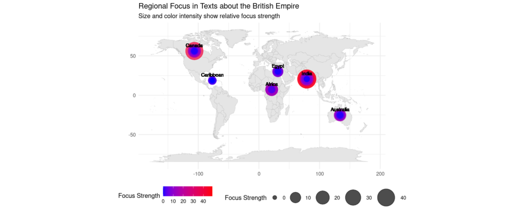
This script takes advantage of the ggplot2 package, which has a lot of flexibility in terms of data display and aesthetic customizations. Here is an example of a map of narrative intensity–in the code, I supply the regions I want to measure intensity for. For this particular map, I also have to define the coordinates, which is kind of a pain, but it also allows you customize on a granular level. In this map, I’ve used the default coordinates for the middle of each country (the generic coordinates available on most maps). But presumably most of the writing about Australia concerns the west coast of the continent and not its center; this is something I could adjust in the code.
A heat map probably makes more sense for this data, and I can make that too. Below, I’ve used a heat map with a customized aesthetic theme and defined fixed coordinates.
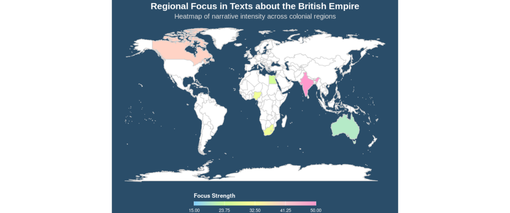
ggplot2 is a powerful library, and it’s easy to sink lots of time into beautiful visualizations–the first image was the default visual I didn’t change, the second one I changed a bit. Now that I’m uploading it, the colors are probably a bit brighter than I’d normally recommend using. It’s hard to see some of the gradations in the heat map. I think this is a good example of the fact that the best thing about R–seemingly infinite customizations–can also be the biggest drawback.
In any event, hopefully you can see how powerful text mining and visualizations can be–in mining a corpus of 1,000 works on the British Empire, we can see pretty clearly which locations are the object of the most narrative intensity–what places were being talked about the most. One question that arises from this for me is the place (or lack thereof!) of Latin America in this data. Economic interest in Latin American mining was prevalent in the Victorian Era, so it might be interesting to dive into Latin American regions in the corpus and see how they compare to places that do figure in the map, such as Australia, India, or Canada. And of course, by manually reviewing the corpus data, it would be possible to select texts based on genre; I could imagine novels, for example, might be more focused on one region than financial reports or newspaper articles, or vice versa.
Here’s the script I used for these:
# In this script, we're going to plot some maps with our data to look at discrete
# regions and evaluate the "narrative intensity" of those regions--in other words,
# how often they were depicted in the corpus

# First let's install our packages
install.packages("stringi")
install.packages("dplyr")
install.packages("ggplot2")
install.packages("maps")
install.packages("stringr")
install.packages("tidyr")
install.packages("tidytext")

# Now we'll load them
library(stringi)
library(dplyr)
library(ggplot2)
library(maps)
library(stringr)
library(tidyr)
library(tidytext)


# Alternative approach using base R to handle problematic characters
empire_texts <- empire_texts %>%
  mutate(
    text_length = sapply(text, function(x) {
#     # Try to handle encoding issues safely
      clean_text <- tryCatch({
      clean <- iconv(x, from = "UTF-8", to = "UTF-8", sub = "")
      if(is.na(clean)) return(0)
      return(nchar(clean))
    }, error = function(e) {
      return(0)  # Return 0 for length if all else fails
    })
     return(clean_text)
   })
 )

regions <- c("India", "Africa", "Australia", "Canada", "Caribbean", "Egypt")


# calculates the proportional regional focus for texts in the corpus
# important to mutate sub out invalid utf-8, or else subsequent code will fail
regional_focus <- empire_texts %>%
  mutate(text = iconv(text, to = "UTF-8", sub = "")) %>%  # Clean at the start
  filter(gutenberg_id != 1470, gutenberg_id != 3310, gutenberg_id != 6134,
         gutenberg_id != 6329, gutenberg_id != 6358, gutenberg_id != 6469) %>%
  group_by(gutenberg_id, title) %>%
  summarize(text = paste(text, collapse = " ")) %>%
  mutate(
    text_length = str_length(text),
    india_focus = str_count(text, regex("India|Indian|Hindustan", ignore_case = TRUE)),
    africa_focus = str_count(text, regex("Africa|African|Cape|Natal|Zulu", ignore_case = TRUE)),
    australia_focus = str_count(text, regex("Australia|Sydney|Melbourne", ignore_case = TRUE)),
    caribbean_focus = str_count(text, regex("Jamaica|Barbados|Caribbean|West Indies", ignore_case = TRUE)),
    egypt_focus = str_count(text, regex("Egypt|Egyptian|Nile|Cairo", ignore_case = TRUE)),
    canada_focus = str_count(text, regex("Canada|Canadian|Ontario|Quebec", ignore_case = TRUE))
  ) %>%
  mutate(
    india_ratio = india_focus / text_length * 10000,
    africa_ratio = africa_focus / text_length * 10000,
    australia_ratio = australia_focus / text_length * 10000,
    caribbean_ratio = caribbean_focus / text_length * 10000,
    egypt_ratio = egypt_focus / text_length * 10000,
    canada_ratio = canada_focus / text_length * 10000
  a_ratio = canada_focus / text_length * 10000)


# Let's start putting a map together with a focus on different regions
regional_summary <- regional_focus %>%
  summarise(
    India = sum(india_ratio, na.rm = TRUE),
    Africa = sum(africa_ratio, na.rm = TRUE),
    Australia = sum(australia_ratio, na.rm = TRUE),
    Caribbean = sum(caribbean_ratio, na.rm = TRUE),
    Egypt = sum(egypt_ratio, na.rm = TRUE),
    Canada = sum(canada_ratio, na.rm = TRUE)
  ) %>%
  # Reshape to long format for mapping
  pivot_longer(cols = everything(),
               names_to = "region",
               values_to = "focus_strength")

# Creates a data frame with coordinates for each region prevalent in the data
region_coords <- data.frame(
  region = c("India", "Africa", "Australia", "Caribbean", "Egypt", "Canada"),
  lon = c(78.9629, 21.0936, 133.7751, -76.8099, 31.2357, -106.3468),
  lat = c(20.5937, 7.1881, -25.2744, 18.7357, 30.0444, 56.1304)
)

# Combine text focus with region
map_data <- left_join(region_coords, regional_summary, by = "region")

# Get world map data
world <- map_data("world")

# Create the map!
ggplot() +
  # World map background
  geom_polygon(data = world,
               aes(x = long, y = lat, group = group),
               fill = "gray90", color = "gray70", size = 0.1) +
  # Points for each region sized and colored by focus strength
  geom_point(data = map_data,
             aes(x = lon, y = lat,
                 size = focus_strength,
                 color = focus_strength),
             alpha = 0.7) +
  # Optional: Add region labels
  geom_text(data = map_data,
            aes(x = lon, y = lat, label = region),
            vjust = -1, size = 3) +
  # Customize the appearance
  scale_size_continuous(range = c(3, 15), name = "Focus Strength") +
  scale_color_gradient(low = "blue", high = "red", name = "Focus Strength") +
  theme_minimal() +
  labs(title = "Regional Focus in Texts about the British Empire",
       subtitle = "Size and color intensity show relative focus strength",
       x = NULL, y = NULL) +
  coord_fixed(1.3) +  # Keeps map proportions reasonable
  theme(legend.position = "bottom")

# This is a bit easier because you don't have to supply the coordinates
# but we do need to normalize the values in the focus strength field, so we'll
# add those values to regional_summary

# Assuming world_subset is prepared as in previous examples
# If not, here's a quick setup (replace with your actual data prep):
world <- map_data("world")
# Example map_data from earlier
region_coords <- data.frame(
  region = c("India", "Africa", "Australia", "Caribbean", "Egypt", "Canada"),
  lon = c(78.9629, 21.0936, 133.7751, -76.8099, 31.2357, -106.3468),
  lat = c(20.5937, 7.1881, -25.2744, 18.7357, 30.0444, 56.1304),
  focus_strength = c(50, 30, 20, 15, 25, 40)  # Replace with your actual focus_strength
)
country_regions <- data.frame(
  region = c("India", "Africa", "Africa", "Australia", "Caribbean", "Caribbean", "Egypt", "Canada"),
  country = c("India", "South Africa", "Nigeria", "Australia", "Jamaica", "Barbados", "Egypt", "Canada")
)
map_data_countries <- left_join(country_regions, region_coords[, c("region", "focus_strength")], by = "region")
world_subset <- world %>% left_join(map_data_countries, by = c("region" = "country"))

# Create the heatmap
ggplot() +
  # World map with heatmap fill
  geom_polygon(data = world_subset,
               aes(x = long, y = lat, group = group, fill = focus_strength),
               color = "#2a4d69", size = 0.05) +  # Thin, dark borders for contrast
  # Landmass background (middle)
  geom_polygon(data = world,
               aes(x = long, y = lat, group = group),
               fill = "#5A5A5A", color = "#B0B0B0", size = 0.3) +  # Even lighter gray
  # Heatmap layer (top, fully opaque)
  geom_polygon(data = world_subset,
               aes(x = long, y = lat, group = group, fill = focus_strength),
               color = "#D0D0D0", size = 0.4, alpha = 1) +  # No transparency
  # Bright, adjusted gradient
  scale_fill_gradientn(
    colors = c("#80CFFF", "#CCFF99", "#FFFF99", "#FFCCCC", "#FF99CC"),  # Super bright palette
    name = "Focus Strength",
    na.value = "transparent",
    limits = c(min(world_subset$focus_strength, na.rm = TRUE),
               max(world_subset$focus_strength, na.rm = TRUE)),  # Full data range
    breaks = seq(min(world_subset$focus_strength, na.rm = TRUE),
                 max(world_subset$focus_strength, na.rm = TRUE), length.out = 5),
    guide = guide_colorbar(barwidth = 15, barheight = 0.5, title.position = "top")
  ) +
  # Theme
  theme_void() +
  theme(
    plot.background = element_rect(fill = "#2A4D69", color = NA),
    panel.background = element_rect(fill = "#2A4D69", color = NA),
    plot.title = element_text(family = "Arial", size = 16, color = "#FFFFFF",
                              face = "bold", hjust = 0.5),
    plot.subtitle = element_text(family = "Arial", size = 12, color = "#E0E0E0",
                                 hjust = 0.5),
    legend.position = "bottom",
    legend.title = element_text(color = "#FFFFFF", size = 10, face = "bold"),
    legend.text = element_text(color = "#FFFFFF", size = 8),
    legend.background = element_rect(fill = "transparent", color = NA)
  ) +
  labs(
    title = "Regional Focus in Texts about the British Empire",
    subtitle = "Heatmap of narrative intensity across colonial regions"
  ) +
  coord_fixed(1.3)
Leave a Reply